A hashtag picker dialog was implemented twice, with slight differences.
Now there is only one
- with hashtag validation - no more api errors when following an invalid
one
- The dialog can now be closed with the keyboard, for extra fast hashtag
selection
- with autocomplete

I also added a new snackbar when following a hashtag was succesfull.

Although I'm not sure about the auto complete, it can be very annoying
as the drop down covers the buttons. I found no way to make it size to
its content: https://chaos.social/@ConnyDuck/113803457147888844

Should we get rid of it?
The way that translations are shown on the Weblate interface is
sometimes incorrect compared to how the string resources are processed
by Android, I think because of how Weblate reads newlines and spaces. I
guess it's Weblate's fault, but since that's what we use, I'm hoping
this MR fixes the discrepancy, or at least minimises it.
I've opted to collapse multi-line strings onto one line (i.e.
`help_empty_home`), unless there's a list or something (i.e.
`wellbeing_mode_notice`) in which case (for XML source readability)
minimal newlines are used which hopefully makes the Weblate issue
uniform and minor, if it appears at all.
Here's an example of a good string in the strings.xml:
```
<string name="action_post_failed_detail">Your post failed to upload and has been saved to drafts.\n\nEither the server could not be contacted, or it rejected the post.</string>
```
How it appears in Weblate (note that there no extra spaces anywhere):

Here are the problems:
### Example 1
String in strings.xml:
```
<string name="dialog_whats_an_instance">The address or domain of any instance can be entered
here, such as mastodon.social, icosahedron.website, social.tchncs.de, and
<a href="https://instances.social">more!</a>
\n\nIf you don\'t yet have an account, you can enter the name of the instance you\'d like to
join and create an account there.\n\nAn instance is a single place where your account is
hosted, but you can easily communicate with and follow folks on other instances as though
you were on the same site.
\n\nMore info can be found at <a href="https://joinmastodon.org">joinmastodon.org</a>.
</string>
```
How it appears in Weblate (note the spaces between words where there is
a newline char in the strings.xml, and the trailing spaces at the very
end of the string because the XML tag is on the next line):

### Example 2
String in strings.xml:
```
<string name="wellbeing_mode_notice">Some information that might affect your mental wellbeing will be hidden. This includes:\n\n
- Favorite/Boost/Follow notifications\n
- Favorite/Boost count on posts\n
- Follower/Post stats on profiles\n\n
Push-notifications will not be affected, but you can review your notification preferences manually.
</string>
```
How it appears in Weblate (note the incorrect space in front of the last
line of the source and target languages):

### Example 3
String in strings.xml:
```
<string name="help_empty_lists">This is your <b>lists view</b>. You can define a number of private lists and add accounts to that.
\n\n
NOTE that you can only add accounts you follow to your lists.
\n\n
These lists can be used as a tab in Account preferences [iconics gmd_account_circle] [iconics gmd_navigate_next] Tabs.
</string>
```
How it appears in Weblate (for some reason the target language string
keeps having more and more spaces added to it, I can't delete them, they
keeping being added back again, perhaps it's because of only having \n
newline text on a line?):

There are other issues as well, and I don't know what causes them. They
should be fixed somehow, but that might be (automatic?) formatting or
something at your end that I can't help with. You can see some of them
fairly recently by browsing
https://weblate.tusky.app/changes/browse/tusky/tusky/cy/ - entries where
it says "String updated in the repository" and the edit is just
whitespace changes. Here's an example where extra whitespace keeps
getting added to the target language:
String in strings.xml:
```
<string name="error_missing_edits">Your server knows that this post was edited, but does not have a copy of the edits, so they can\'t be shown to you.\n\nThis is <a href="https://github.com/mastodon/mastodon/issues/25398">Mastodon issue #25398</a>.</string>
```
How it appears in Weblate (the incorrect spaces keep getting added back
in the target language):

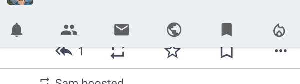
This was so much work wow. I think it works pretty well and is the best
compromise between all the alternative we considered. Yes the
pull-to-refreh on the notifications works slightly different now when
the new bar is visible, but I don't think there is a way around that.
Things I plan to do later, i.e. not as part of this PR or release:
- Cache the notification policy summary for better offline behavior and
less view shifting when it loads
- try to reduce some of the code duplications that are now in there
- if there is user demand, add a "legacy mode" setting where this
feature is disabled even if the server would support it
closes#4331closes#4550 as won't do
closes#4712 as won't do
<img
src="https://github.com/user-attachments/assets/de322d3c-3775-41e7-be57-28ab7fbaecdf"
width="240"/> <img
src="https://github.com/user-attachments/assets/1ce958a4-4f15-484c-a337-5ad93f36046c"
width="240"/> <img
src="https://github.com/user-attachments/assets/98b0482b-1c05-4c99-a371-f7f4d8a69abd"
width="240"/>
Follow up to https://github.com/tuskyapp/Tusky/pull/3921

- no more hardcoded `tusky_blue`, instead the `colorPrimary` attribute
is used. This will help us when adding more themes, e.g a dynamic color
one.
- The `colorPrimary` of the dark theme is now lighter for more contrast
and subsequently the `colorOnPrimary` is now dark grey instead of white.
- `tusky_red_lighter` is now a bit more red than before
- Tweaked color usage in a few places for better contrast

I think this looks a bit unfamiliar but overall better and the higher
contrast makes things noticeably easier to read.

<img
src="https://github.com/tuskyapp/Tusky/assets/10157047/4cbb92d8-b772-4e94-bc15-c4baf0e5473f"
width="260"/>
closes#4499
This restores support for v1 filters. The problem was that the state was
uncoditionally set to error instead of checking the v1 response.
While checking the code I found some other problems:
- Two error messages that were shown to users were not translatable
- When filters were updated sometimes `PreferenceChangedEvent` was sent
instead of `FilterUpdatedEvent`
- The notifications fragment was not listening to the
`FilterUpdatedEvent`
This PR fixes https://github.com/tuskyapp/Tusky/issues/2798 and is
mostly based on and supersedes
https://github.com/tuskyapp/Tusky/pull/2826 but I have fixed all merge
conflicts and unit tests.

I tested the changes locally and the setting takes effect immediately
for replies, and persists across killing the app.

---------

Co-authored-by: Eva Tatarka <eva@tatarka.me>
Co-authored-by: Konrad Pozniak <connyduck@users.noreply.github.com>
As discussed in our contributors meeting.

Advantages:
- last element of list never obscured by action button
- less code that runs on every scroll
- less settings to worry about

Additionally:
- Added a (smaller) padding to the bottom of lists without action
button, I think it looks nice if there is a bit of white space and the
nav bar divider and the last list divider don't touch.
- The list of filters had no dividers, I added them.
- Recyclerviews with fixed height (Drafts, Filters, edits) now have
scrollbars
- code formatted all touched xml files

closes https://github.com/tuskyapp/Tusky/issues/1563

<img
src="https://github.com/tuskyapp/Tusky/assets/10157047/cd50199f-e84f-4402-93e4-a5a1beba2a08"
width="280"/>
This means a popup will appear if you have that option enabled in the
preferences which will have a popup similar to the unfollow dialog
asking you if you want to follow the user.
This refactors the NotificationsFragment and related classes to Kotlin &
paging.
While trying to preserve as much of the original behavior as possible,
this adds the following improvements as well:
- The "show notifications filter" preference was added again
- The "load more" button now has a background ripple effect when clicked
- The "legal" report category of Mastodon 4.2 is now supported in report
notifications
- Unknown notifications now display "unknown notification type" instead
of an empty line

Other code quality improvements:
- All views from xml layouts are now referenced via ViewBindings
- the classes responsible for showing system notifications were moved to
a new package `systemnotifications` while the classes from this
refactoring are in `notifications`
- the id of the local Tusky account is now called `tuskyAccountId` in
all places I could find

closes https://github.com/tuskyapp/Tusky/issues/3429

---------

Co-authored-by: Zongle Wang <wangzongler@gmail.com>
While working on #4249 I noticed that quick replies also don't work as
expected. The notification just stays in the sending state forever.
There are actually 2 problems:
- Notifications are sent in `NotificationFetcher` with the id of the
Mastodon notification as tag and the current account id as id. The wrong
notification id was forwarded to `SendStatusBroadcastReceiver` so it
never had a chance of updating the notification.
- Notifications containing an active remote input can't be cancelled
(they just stop their animation when doing so). So instead I update the
notification with info that the reply is being sent and have it dismiss
automatically.

I also tried replacing the original notification with the "sending"
notification of `SendStatusService`, but that doesn't work because
`Service.startForeground` doesn't have a tag parameter, only an id.

---------

Co-authored-by: Willow <charlag@tuta.io>
#4205 did change how the counters for the detailed posts behave and for
a good reason I believe.
However I find the changed order very confusing and not aesthetically
pleasing.
I have tried a few options, including reserving space for it but it was
confusing (when counters are not displayed there would be a danging
separator or if we show separator together with it it would be confusing
as well).
I propose we simply show the counters independent on the counts. I know
we try to de-emphasize the counters but I believe this is fine to do in
detailed view.
One disadvantage is that we need translators to update the translations.
Additionally I've done two spacing changes: I removed a separator
between the counters and the buttons, removed padding around the
counters and increased the space between the counters and the buttons
instead. I believe it's better to use space than separators. This also
makes the space above/below the media/counters separator balanced.
In the second commit I've also made the metadata/counters separators
thinner, I think it looks better.
here's the combined version:

# Overview
In the previous code, when you open preferences, there is a section
headed "Filters" with a section called "Tabs"
This is confusing.
# Changes
- Change the section title from "Filters" to "Per-timeline preferences."
- Change the current "Tabs" section to "Home timeline" since it is only
for home timelines
# Screenshots
account preference screen | detail screen
:--: | :--:
|<image
src="https://github.com/tuskyapp/Tusky/assets/62137820/12694f24-b7e3-4ba3-90f5-53740e9c4269"
width="250" />|<image
src="https://github.com/tuskyapp/Tusky/assets/62137820/796e9ac1-76d6-43ef-a087-a1cd2d899ef8"
width="250" />
# Note
- Maybe string resources should have a new property? (for translation)
# Related link
Fixes#3536
---------
Co-authored-by: mcc <andi.m.mcclure@gmail.com>
This changes one word in the string `pref_failed_to_sync` in the file
`values/strings.xml`.

See my reasoning here #4133

"Failed to sync settings" changes to "Failed to sync preferences".
Fixes: #4063
Switching from an AlertDialog to only a DialogFragment.
I didn't get the AlertDialog to be sized correctly.
It also opens now directly with the right (full screen) size. When the
imageView fails to load (i.e. with an audio file) it will be hidden.
This changes the button layout somewhat.
One observation: The placeholder text "... visually impaired..." is not
quite right as a description for an audio file is not intended for the
visually impaired. But I couldn't think of a better text just yet.

Fixes#2512
Can add an arbitrary number of tabs.
Graphical behavior is unchanged for small numbers: the whole space if
filled with the tabs - they are enlarged if needed.
If there are more the mode switches to "scrollable".
This does not, however, look very differently (see screenshot with the
current tab scrolled out).
---------
Co-authored-by: Konrad Pozniak <connyduck@users.noreply.github.com>
Previously the notification filter and clear actions were shown as
buttons in the UI, with a preference that determined whether they were
displayed.

Remove this preference, and display them as menu items.

- "Filter notifications" is shown as an icon, if possible
- "Clear notifications" is only ever shown as a menu item, to reduce the
chance the user inadvertently selects it

To ensure that the options menu appears correctly, remove the code that
creates a "fake" action bar, and adjust the layouts so that there are
three toolbars;

- mainToolbar -- displays the icons, and the current "location" (Home,
Notifications, etc)
- topNav -- displays the row of tabs at the top
- bottomNav -- displays the row of tabs at the bottom

Only one of them is set as the support action bar (depending on the
user's preferences). This provides the "show a logo" and "show the
options menu" functionality as standard, without needing to re-implement
as the previous code did.
Prevent users from accidentally deleting filters by prompting them to confirm.
Add an AlertDialog extension that converts AlertDialog callbacks to linear control flow.
Fixes#3736.